minimalposter: A LaTeX package for creating minimalist posters with minimum pain
Motivation.
I use LaTeX for all my writing and presenting needs, including preparing presentations and posters for conferences. After years of struggling with default beamer themes for presentations, which are quite ugly in my opinion, I settled down on a nice-looking beamer theme for creating presentations. For creating posters with LaTeX, however, the available options are quite lackluster. The block style of Tikzposter is, in my opinion, quite distracting and makes the poster hard to follow. Beamer poster also suffers from the same problem. To design any decent looking poster using either packages one needs to immerse oneself in the dizzying world of frames, blocks and columns and a thousand other design elements provided by these packages. Therefore, I decided to roll-out my own package for creating good looking posters in LaTeX with minimal visual noise and a minimal learning curve. In what follows, I will describe the minimalposter package through an example.
Getting started.
Unlike Tikzposter and Beamer poster, content in minimalposter is organized in columns. Therefore, the first thing
one needs to decide before creating a poster is the orientation, i.e., potrait or landscape, and the number of columns.
Let’s say we want to design a landscape mode poster with three columns. The middle column contains the highlight of the poster, for
example, the main results, and therefore should be wider than the first and last columns. We, therefore, decide on a 2:3:2 ratio
for the width of the columns. In minimalposter we can accomplish this by creating seven (2+3+2) logical columns. The purpose
of the logical columns will become clear later. For now, our poster.tex contains the following lines:
\documentclass[a0,final]{a0poster}
\usepackage[columns=7]{minimalposter}
For creating a potrait mode poster, one would instead use the following: \documentclass[a0,portrait,final]{a0poster}.
Other options accepted by the package are: hmargin and vmargin, which control the horizontal and vertical margin
respectively. For example, \usepackage[columns=7,hmargin=20mm]{minimalposter} creates a poster with 20mm margins on the sides.
Title, authors and such.
Next, we need to set up the title area of the poster. This can be done as follows:
\title{MinimalPoster: A Package for Creating Minimal \LaTeX{} Posters}
\author{Asish Ghoshal \\ aghoshal@purdue.edu\\
Department of Computer Science, Purdue University,
West Lafayette - IN, 47907.}
The title area can also include a logo, for instance, the logo of the institute where the work was done. This is done
by adding the following in poster.tex:
\logo{\includegraphics[scale=1.0]{logo.pdf}}
The footer is set up by the \thanks command, which can also include an image as above.
\thanks{This work was funded by ...}
We then add the following lines in poster.tex to actually create the title and start the main body of the poster.
\begin{document}
\maketitle
The content.
As mentioned before, content is organized into columns. Since we have decided on a 2:3:2 layout. We will create three columns with actual widths 2, 3 and 2, respectively.
\BeginColumn[2]
...
\EndColumn

\BeginColumn[3]
...
\EndColumn

\BeginColumn[2]
...
\EndColumn

\end{document}
Within each column, content is oranized into standard LaTex sections and subsections. From this point onwards, there is no difference between a poster and a standard LaTex document. All standard latex constructs, including but not limited to images, lists, bibliography, equations, and tables, can go into columns.
Sections.
Section headings are by default left aligned. Let’s say we want the section headings to be center aligned.
This can be accomplished by passing the option calign to the package:
\usepackage[columns=7, calign]{minimalposter}
The option for right alignment is, unsurprisingly, ralign.
Highlights.
One can highlight certain areas of the posters, for instance, theorems, figures or tables using the \Alert command as follows:
\Alert{Drinking coffee can lead to a longer life.}
The above command results in a box around the text.
Other customizations.
The package comes with a few color themes. Of these, the tranquil and zen theme are minimal. Other more garish themes are: fury, greed, calm, dirty and fear. Additional color themes can be easily created. Finally, depending on the size of the title area, the top of the columns can either be too close or too far from the title area. This can be changed using the command:
\columntop{1}
A larger number pushes the top of the columns further down.
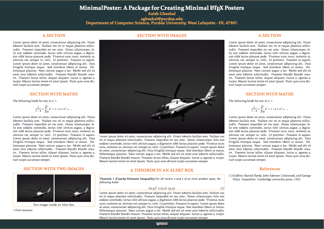
Using a simple columnar layout, with variable column widths, and standard LaTeX constructs, it is possible to create sleek posters in LaTeX in quick time. The following is a demo poster created using minimalposter using the default theme. A complete example is given here
